Authentication (QR Scan)
Design Guidelines
Overview
This guide assumes you have already configured your website or application on other platforms for the ‘เข้าสู่ระบบด้วย เป๋าตัง’ button, and are familiar with the button’s best practices.
Login Button Guidelines
Logo variation
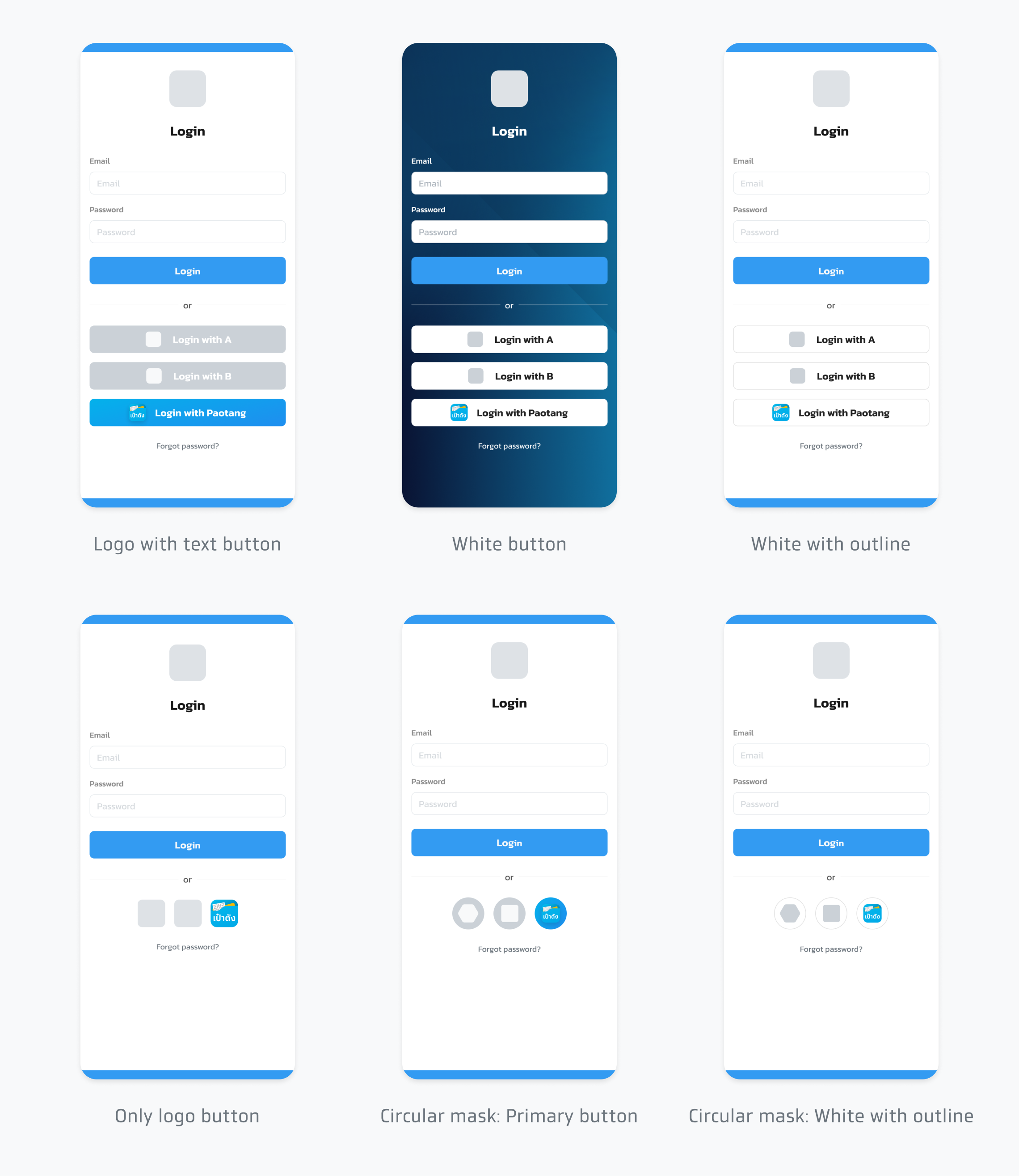
The buttons below are recommended. The way to use them depends on the application's appearance and environment.

Design resource

Download Circular Logo
Color
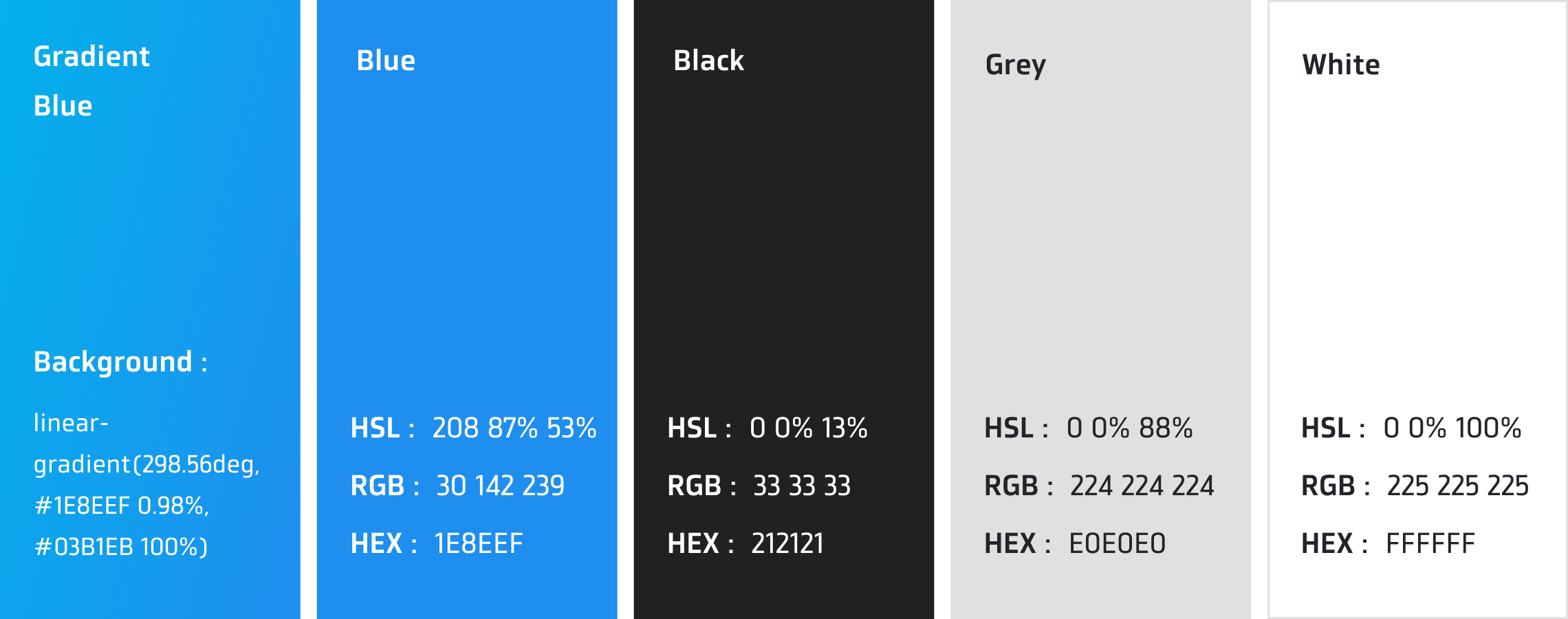
The specified color values below must be used in login button.
Font
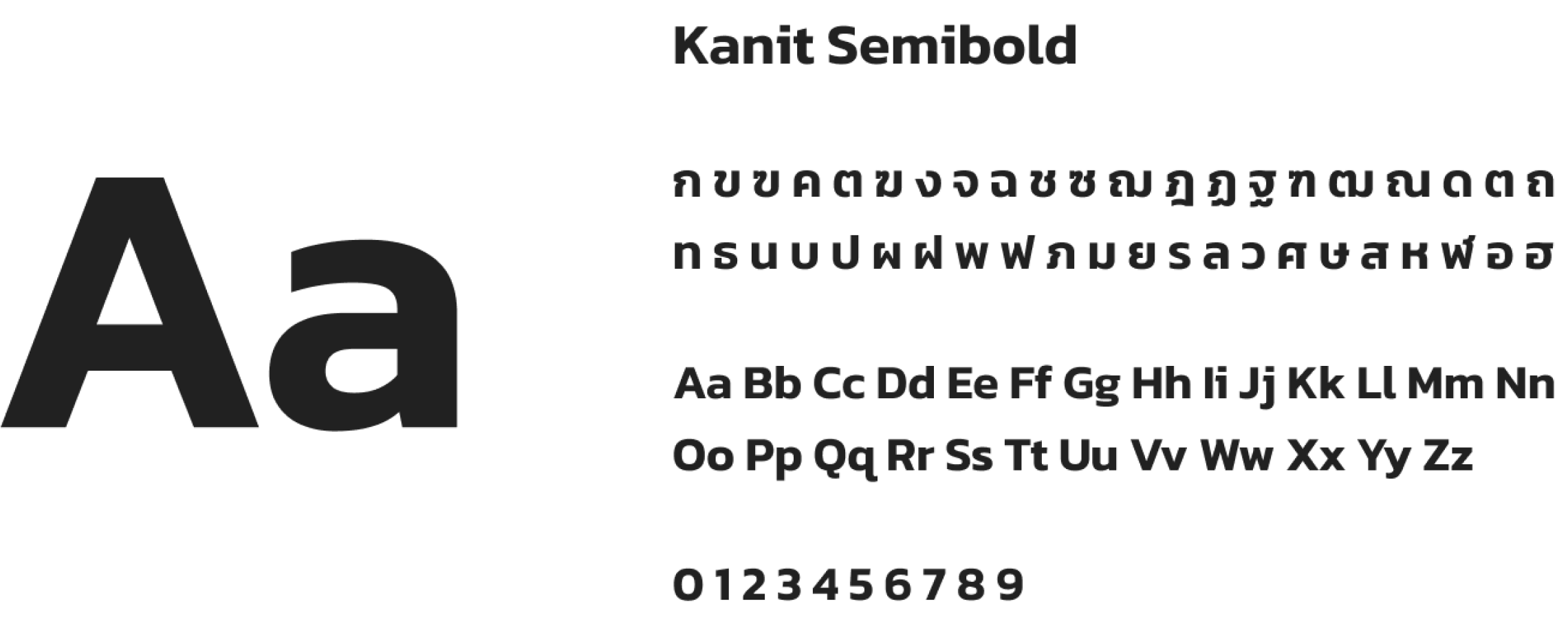
The button font is Kanit SemiBold, a TrueType font available for download at Kanit Fonts.
Text
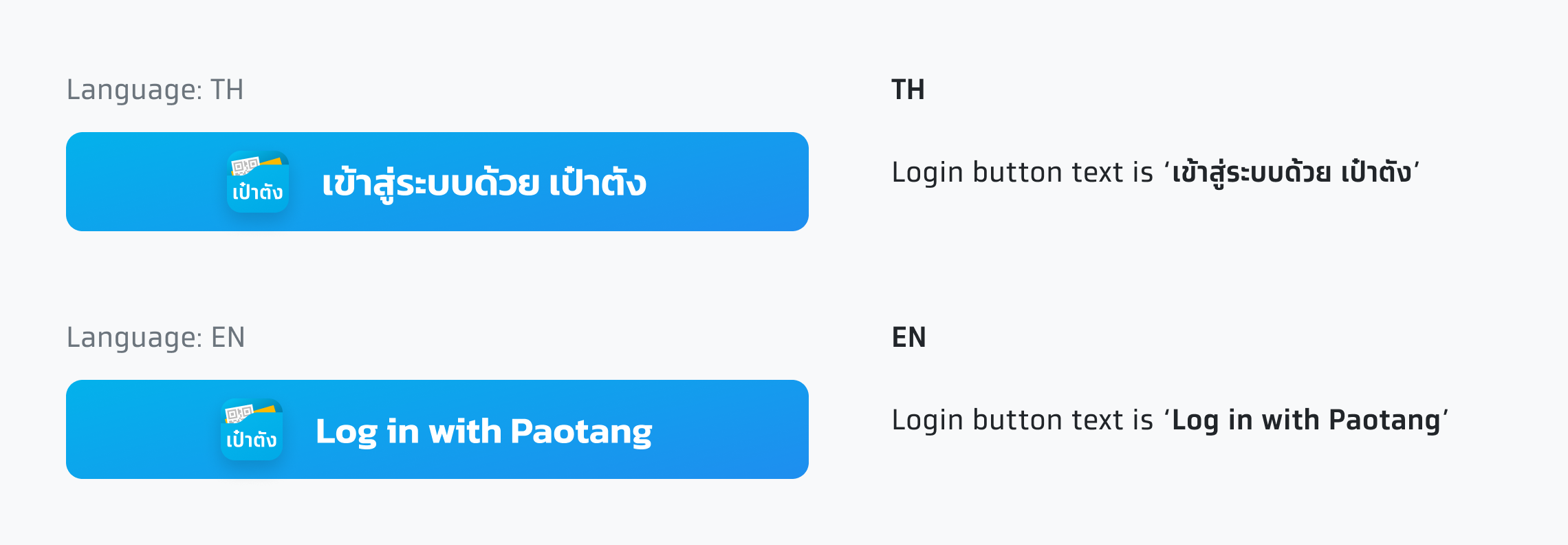
The recommended text for Paotang login button is 'เข้าสู่ระบบด้วย เป๋าตัง'
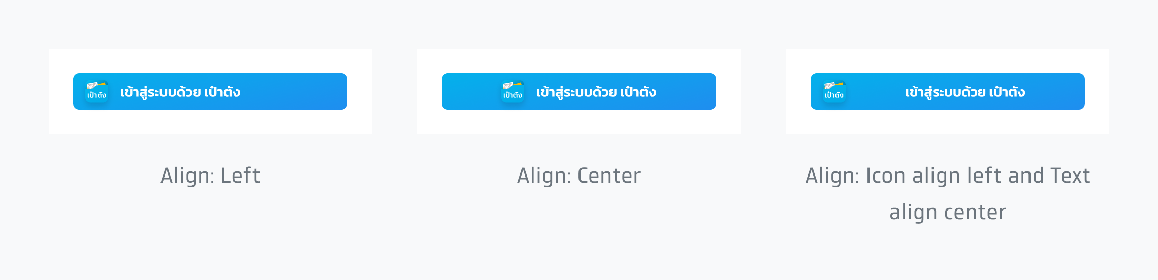
Text alignment
Text alignment can be adjusted to match the application's environment and other buttons.
Color Choices
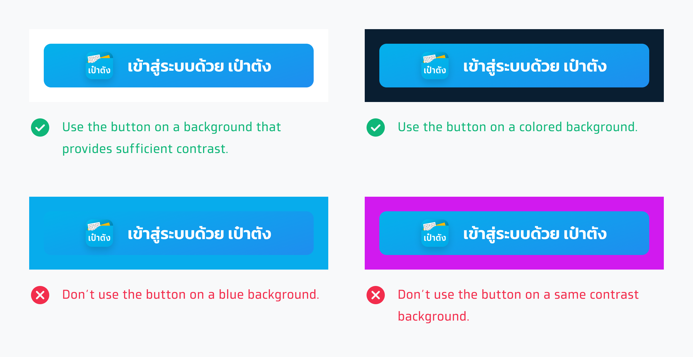
Choose the appearance that works best with the background on which the button displays.
Button with logo and text
Primary button
Use the primary button on the background that provides enough contrast and matches well. The logo must have a shadow.
White button
Use this style on dark backgrounds that provide sufficient contrast. The logo must not have a shadow.

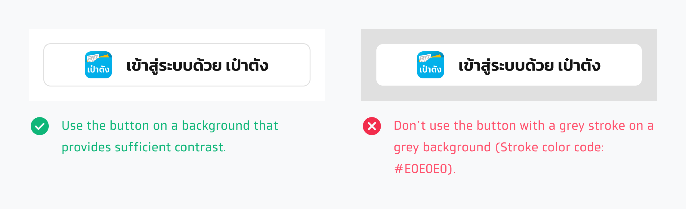
White with outline
Use this style on white backgrounds that provide sufficient contrast. The logo must not have a shadow.
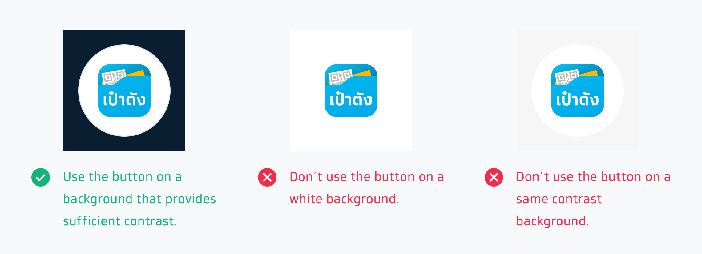
Circular mask
Primary button
Use the primary button on the background that provides enough contrast and matches well. The logo must have a shadow.

White button
Use this style on dark backgrounds that provide sufficient contrast. The logo must not have a shadow.
White with outline
Use this style on white backgrounds that provide sufficient contrast. The logo must not have a shadow.
Only logo button
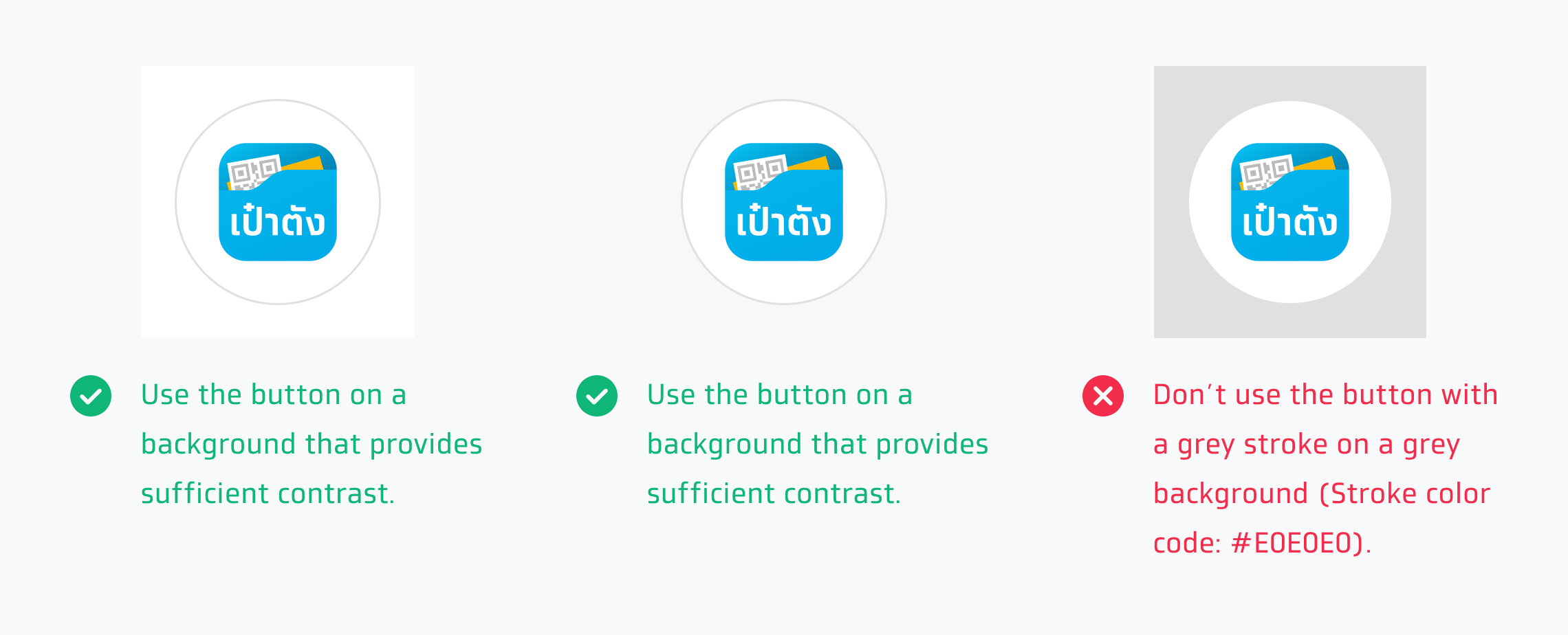
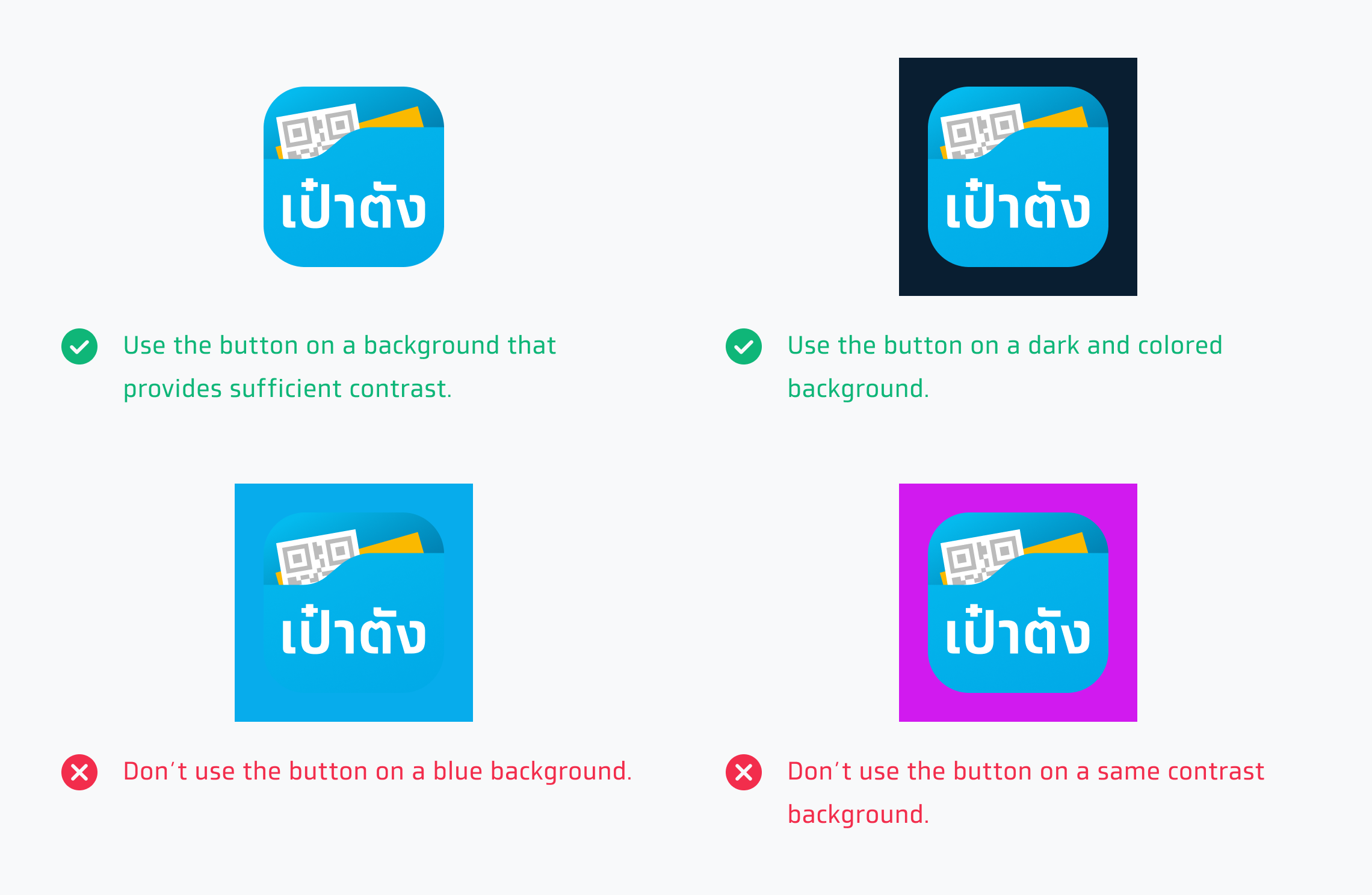
The logo button without a background should be displayed as clickable. So, these are how to create the best logo button for Paotang.
Size & Padding
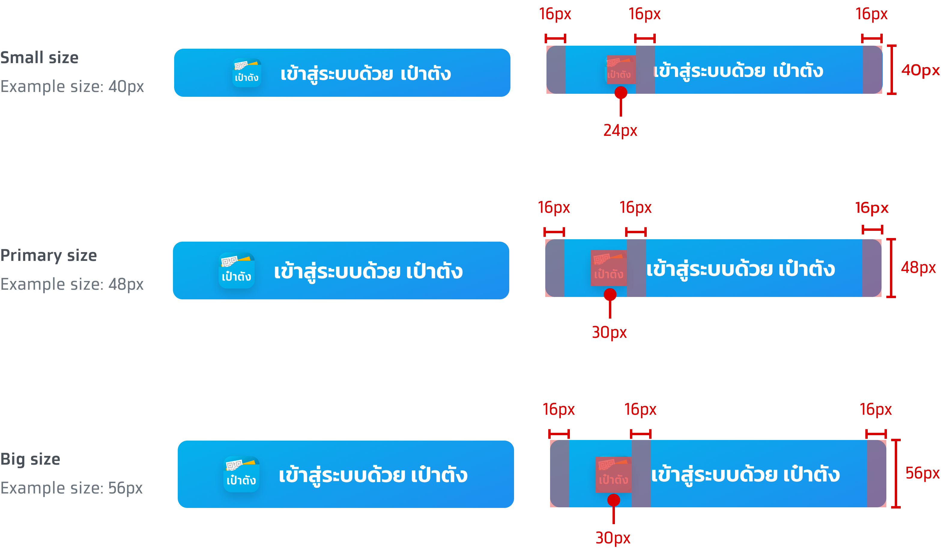
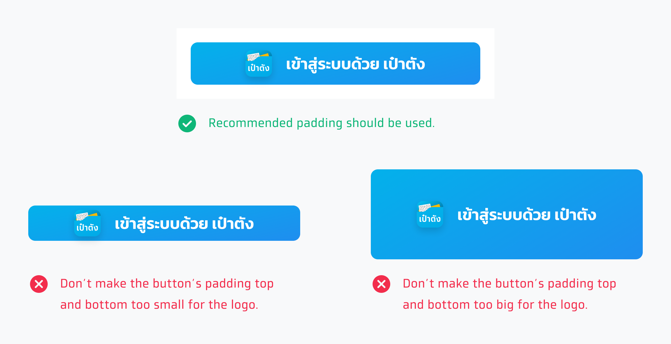
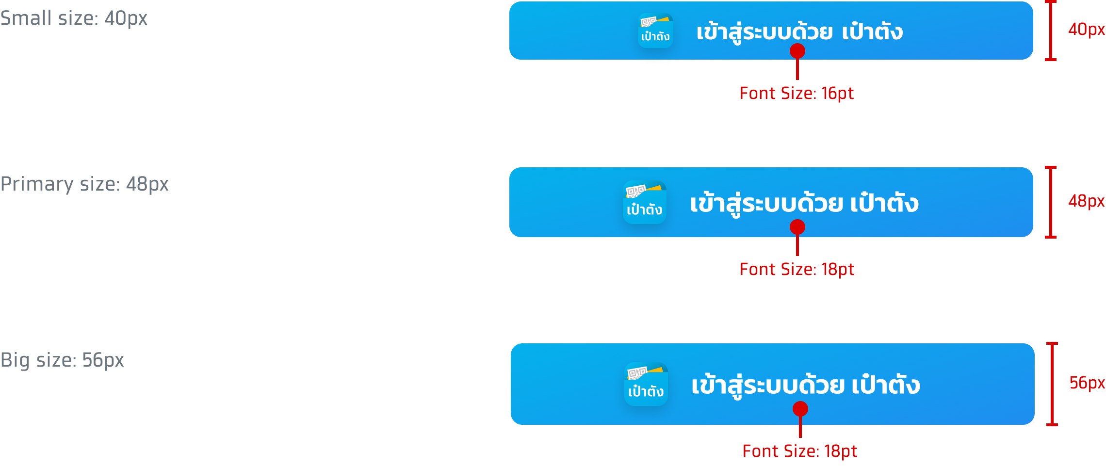
These are button sizes that are usually used in the application. The size number is not fixed and can be adjusted to match with the appearance of other buttons.
Button with logo & text
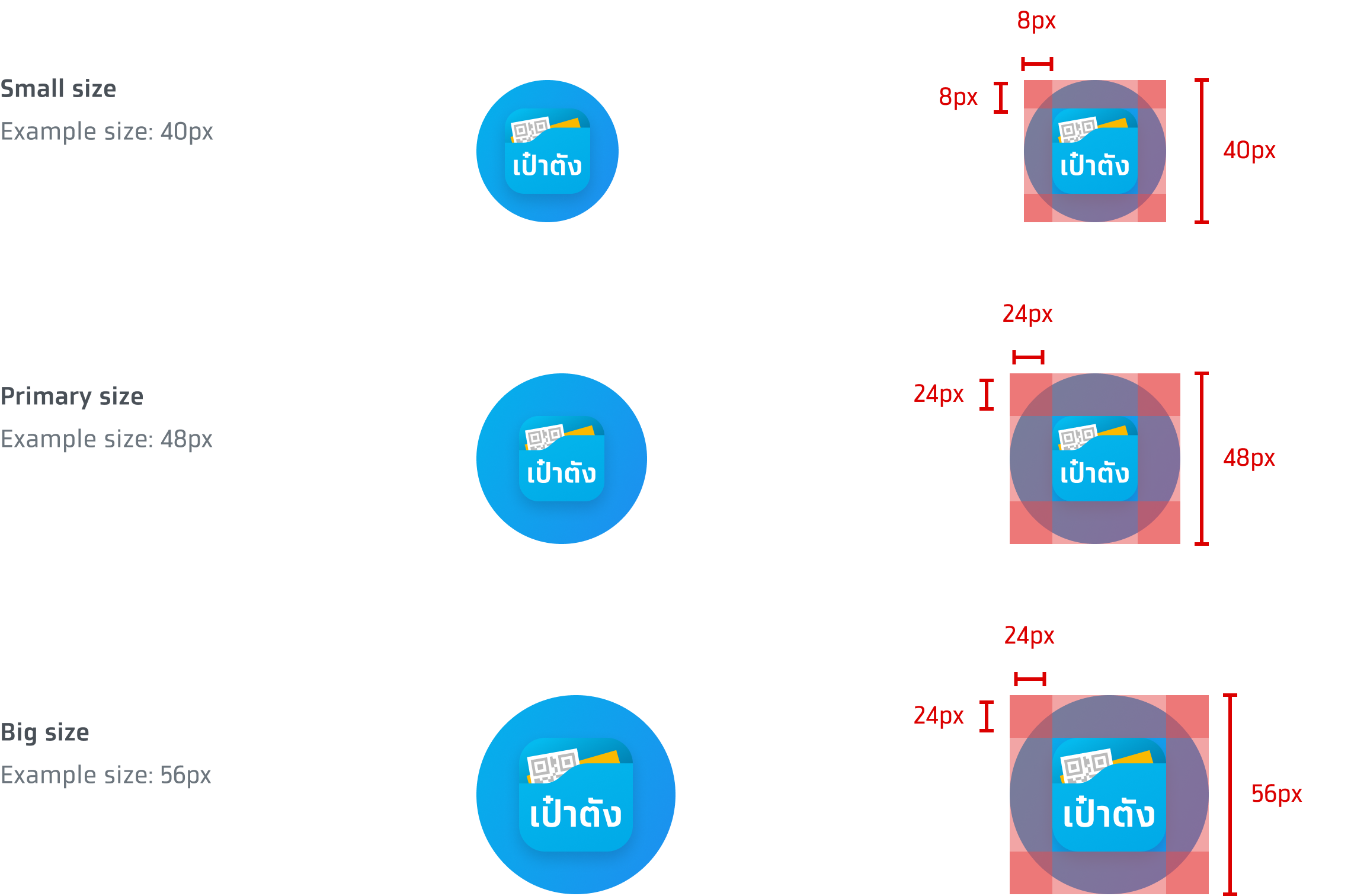
Only logo button
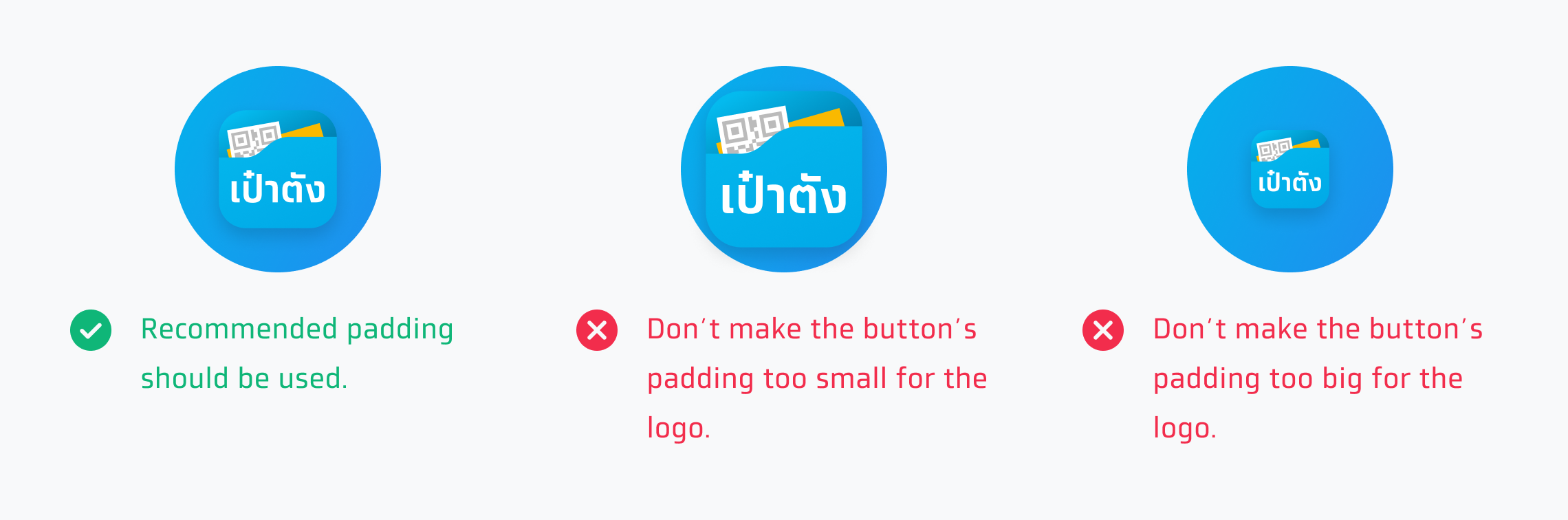
These are button sizes that are usually used in the application. The size and padding number are not fixed and can be adjusted to match with the appearance of other buttons. A logo-only ‘เข้าสู่ระบบด้วย เป๋าตัง’ button always has a 1:1 aspect ratio.
Font size
The recommended font size should not be less than 16pt and should be 43% of the button's height.

Shadow
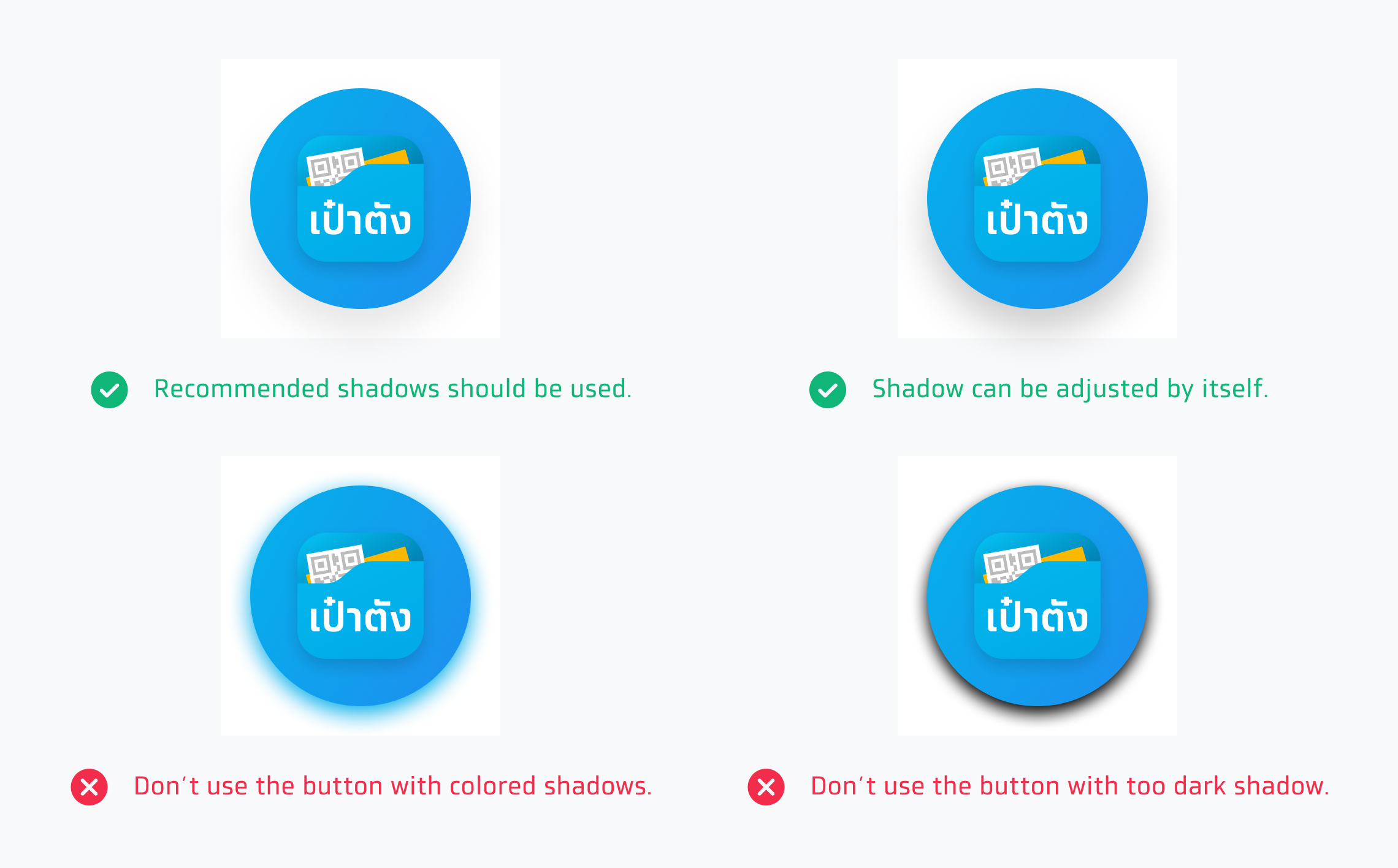
Tips for using shadows on the buttons
How to set logo shadow in button
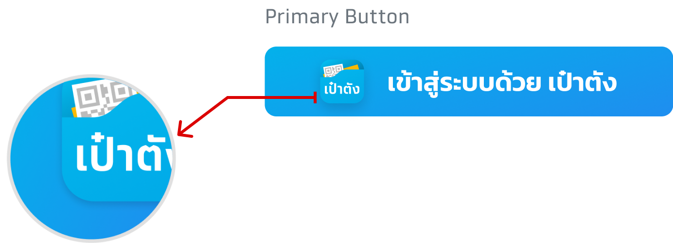

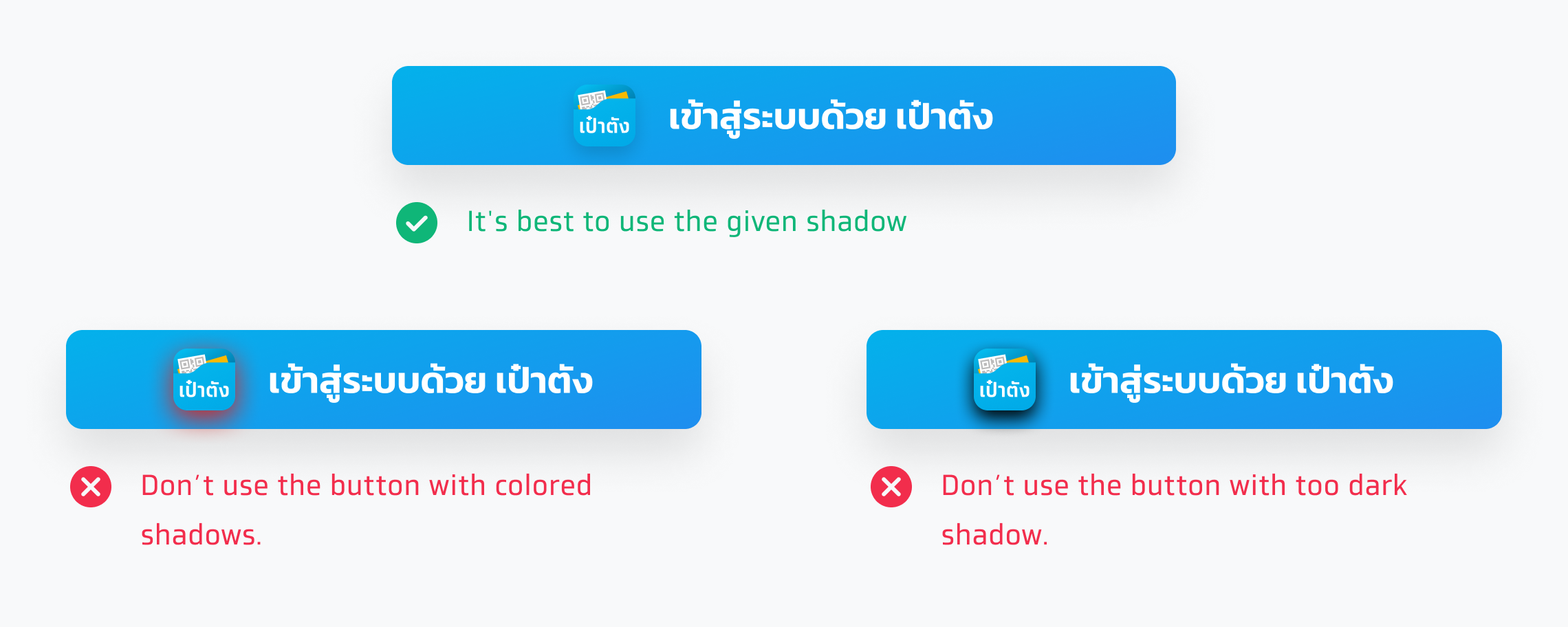
Button shadow
This is the recommended button shadow but it can be adjusted to match the application's environment.


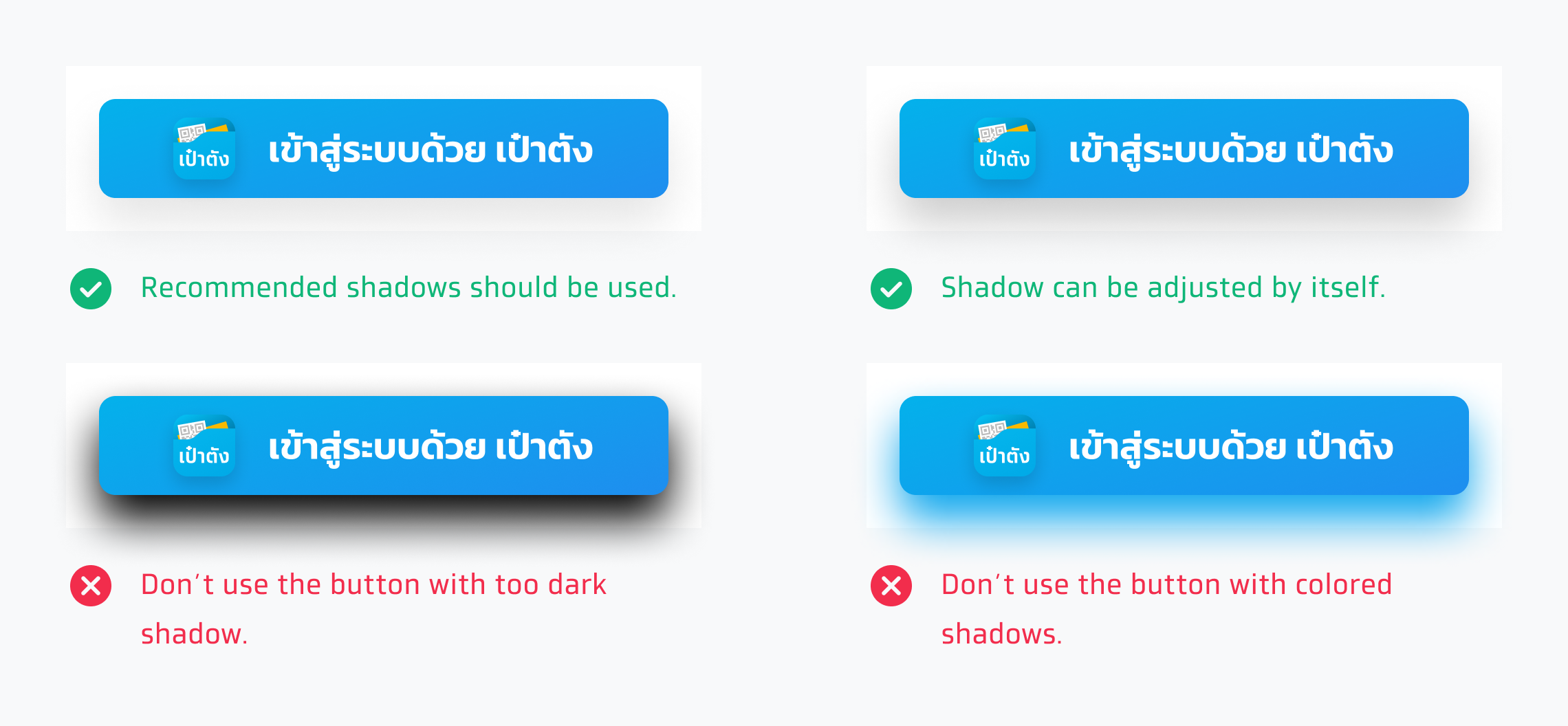
How to set only logo button shadow

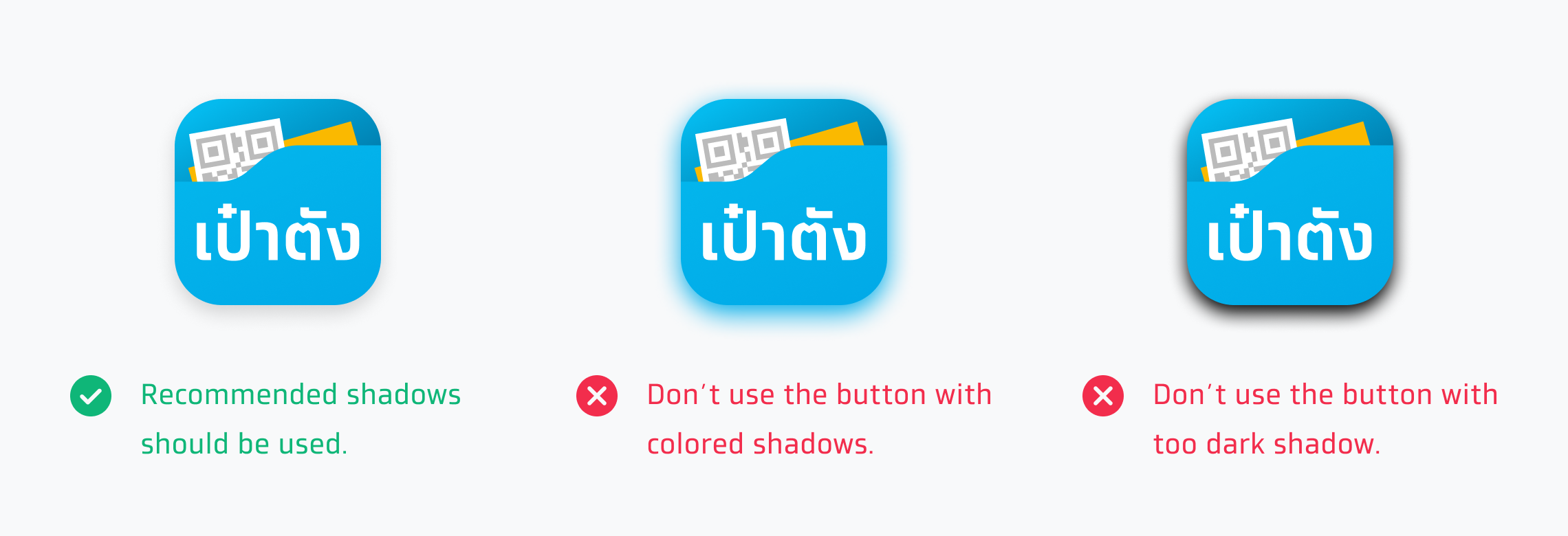
Only logo button shadow
This is the recommended button shadow but it can be adjusted to match the application's environment.

Corner Radius
In general, users are recommended to use the primary corner radius which can be adjusted to match the application’s environment and other buttons.

Usage
The way to use them depends on the application's appearance and environment. For example, use logo with text button or use only logo button.